Billigblomst Website Redesign
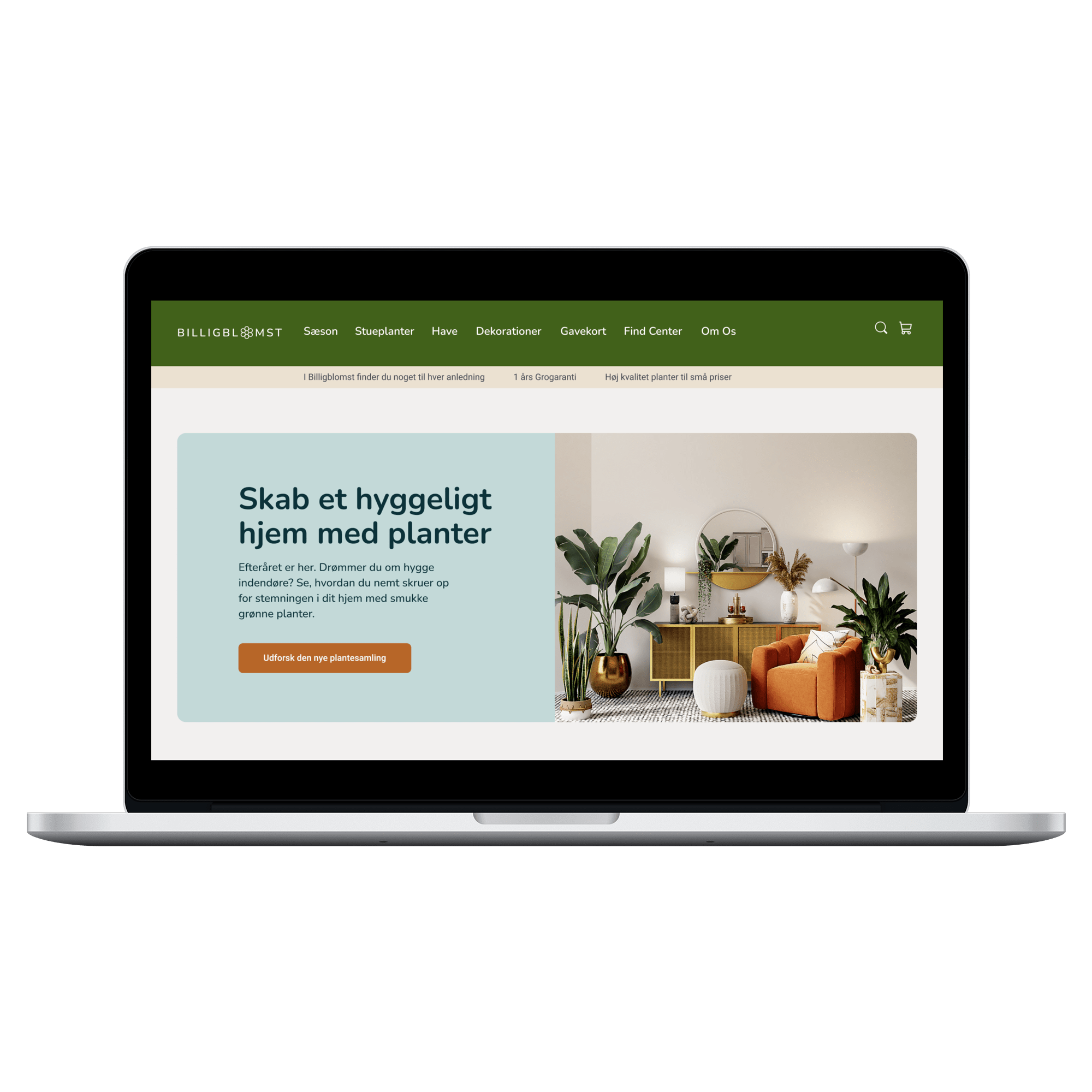
Billigblomst is a popular Danish garden center chain. The goal of this individual project was to improve the buying user experience on their website. This newly proposed digital concept provides customers with an aesthetically pleasing and user-friendly platform for purchasing plants, flowers, decorations, and other gardening products.
Type of project: Individual UX design project, project completed during the Graphic Design & UX/UI course from KEA
My roles: UX Designer, User Researcher, Copywriter,
PM
Tools used: Figma, Miro, Google Drive, Zoom, pen & paper
Duration: 2 weeks (1 week of user research, 1 week of UX design, testing and delivery) – September 2023
Language of the project:
Danish
Project Overview
The Client
Billigblomst is a garden center with 10 stores across Denmark. The company was established in 2011 and offers a wide variety of products at small prices: interior and outdoor plants, bouquets, gardenpots, plant and seasonal decorations, and animal food.
Billigblomst differentiates itself from its competitors by offering an ever-changing selection of plants at affordable prices.
Challenges
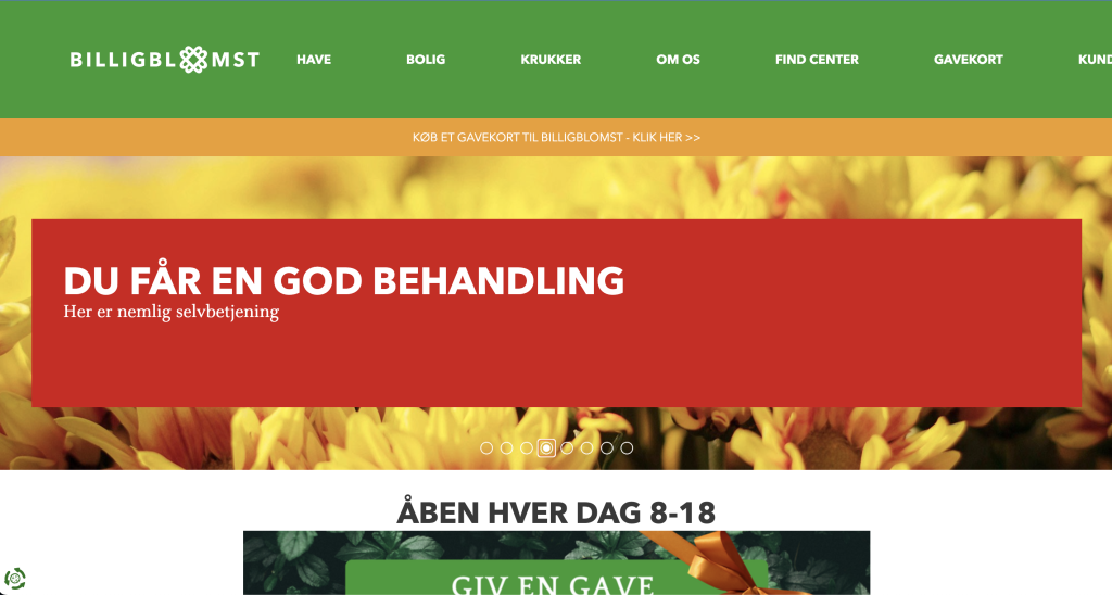
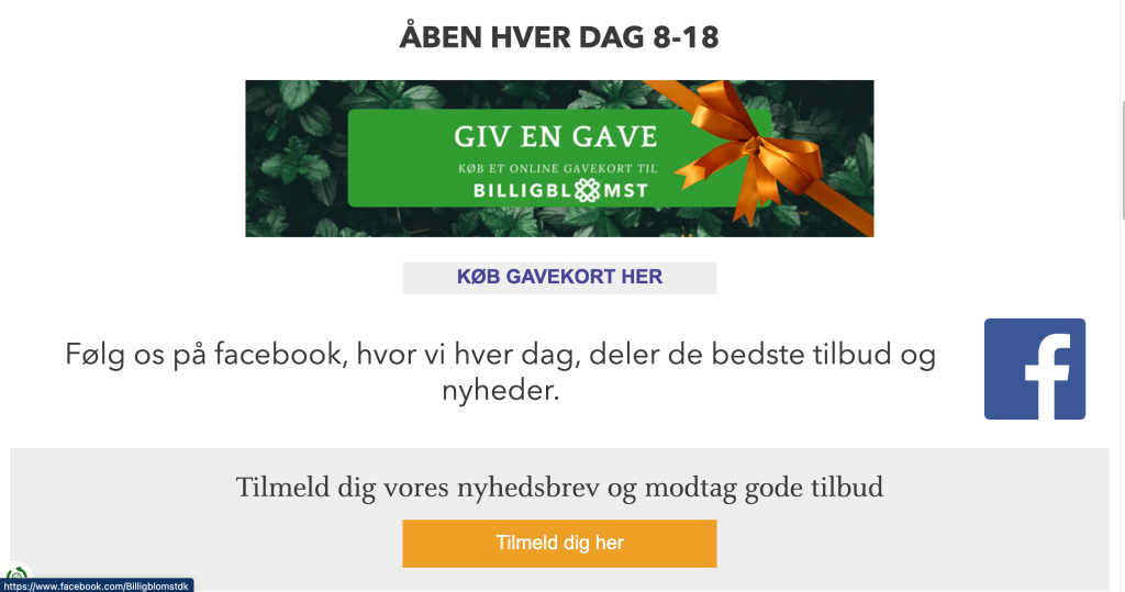
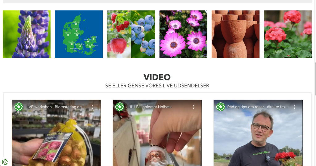
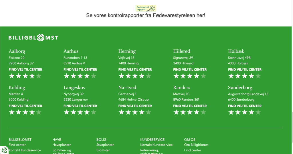
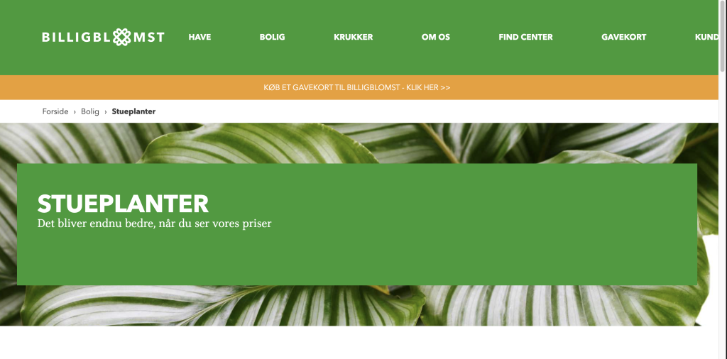
The billigblomst.dk website looks visually cluttered, and doesn’t allow users to:
- buy plants online
- see the prices for plants, thus allowing users to compare prices with competitors’
- find out what plants are in season
- fnd out if specific plants are available in certain stores across the country
- get home decor plant inspiration
- know how to take care of plants
Solution – Outcome
I’m excited to showcase how I’ve turned the Billigblomst website into a user-centric, visually appealing, and fully functional design concept.
My goal was to create a seamless buying experience for budget-conscious homeowners or renters in Denmark who share a passion for plants and garden decorations.
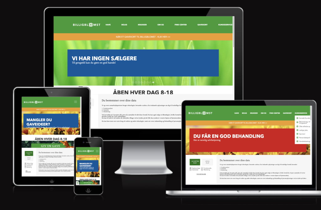
The new design concept is optimised for both desktop and mobile devices.
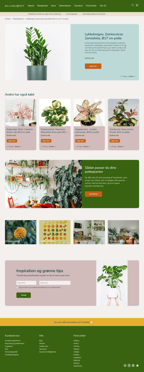
Desktop High Fidelity Mockup
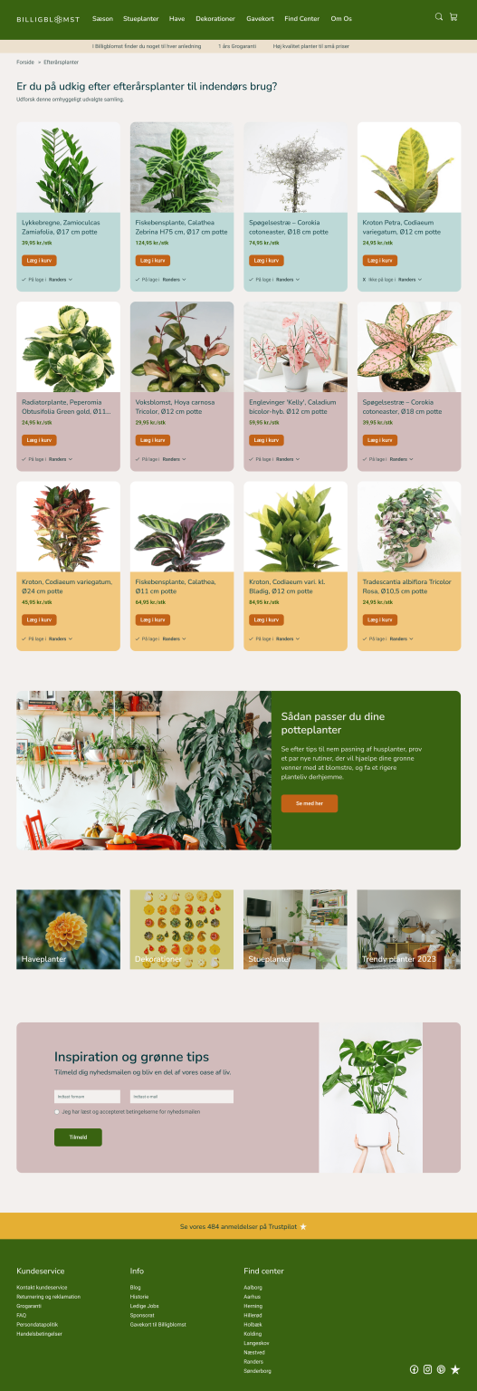

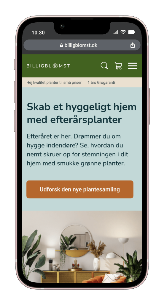
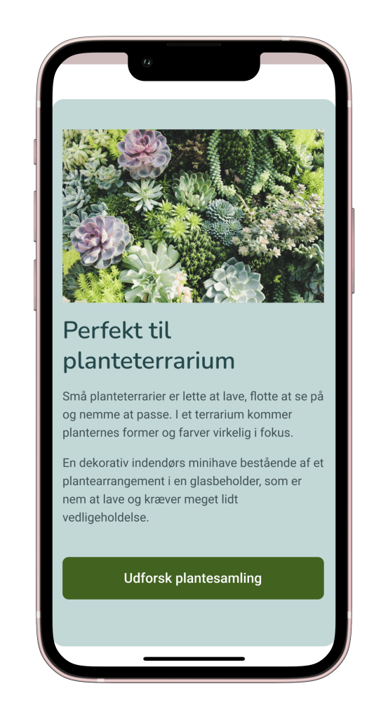
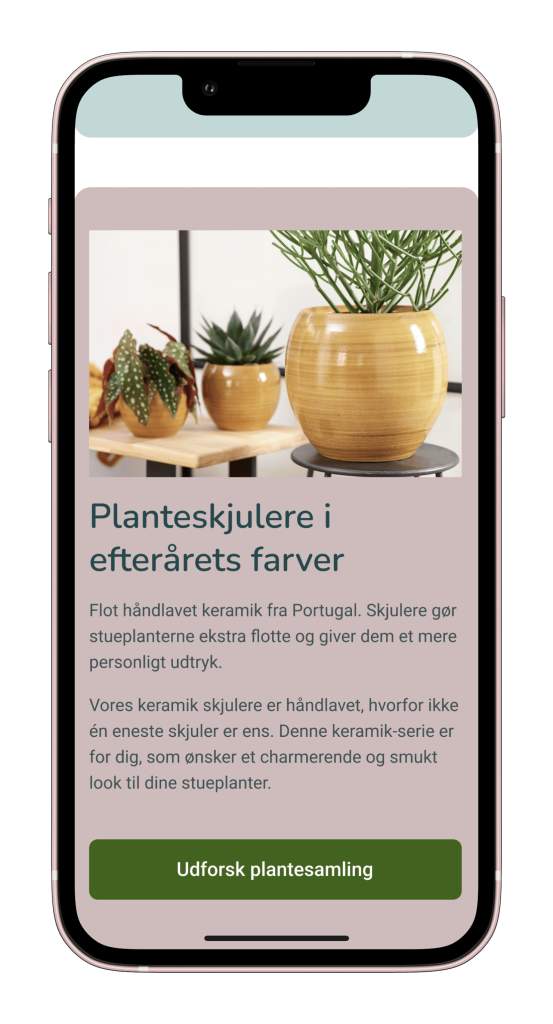
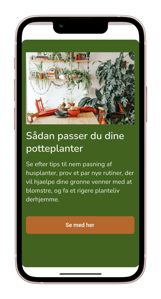
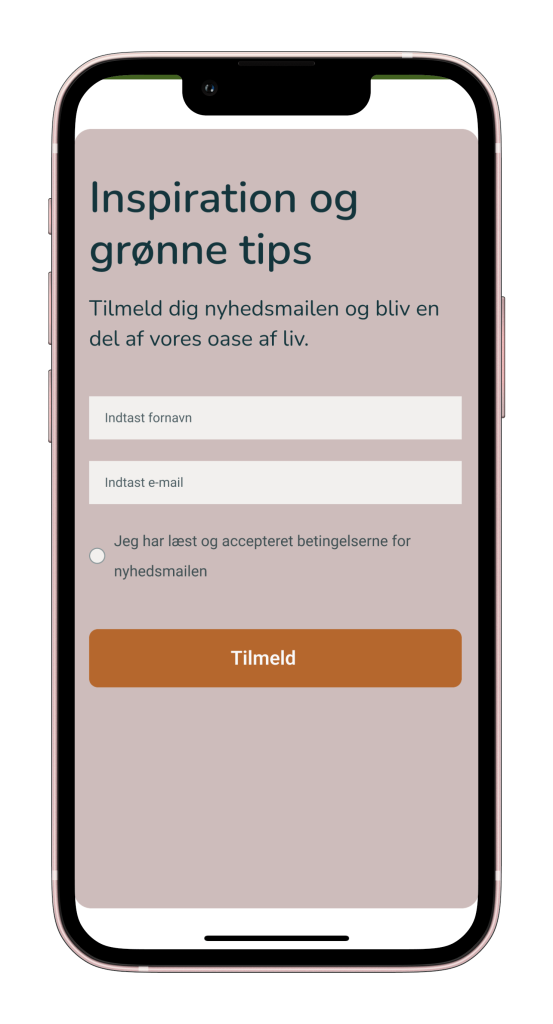
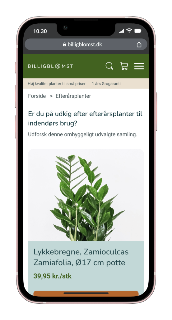
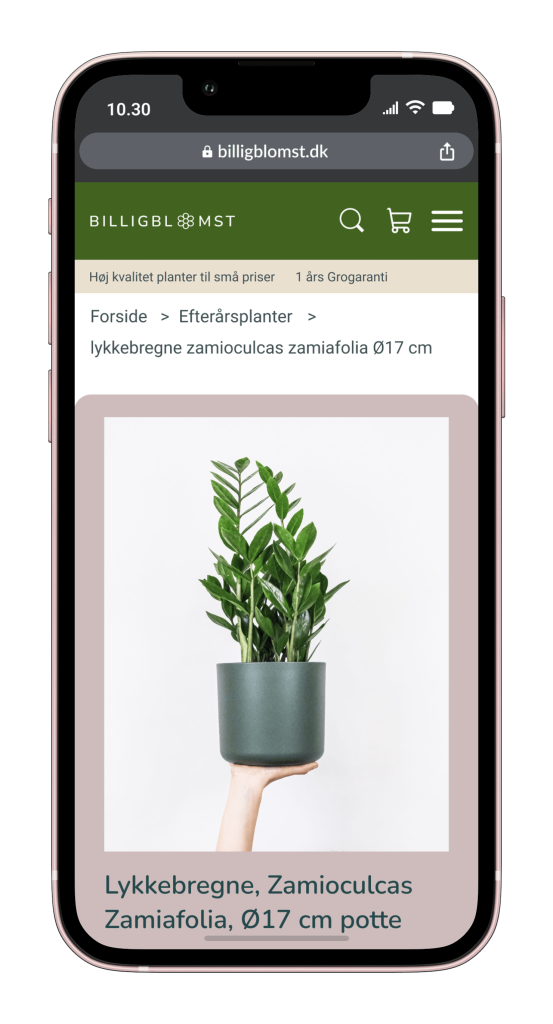
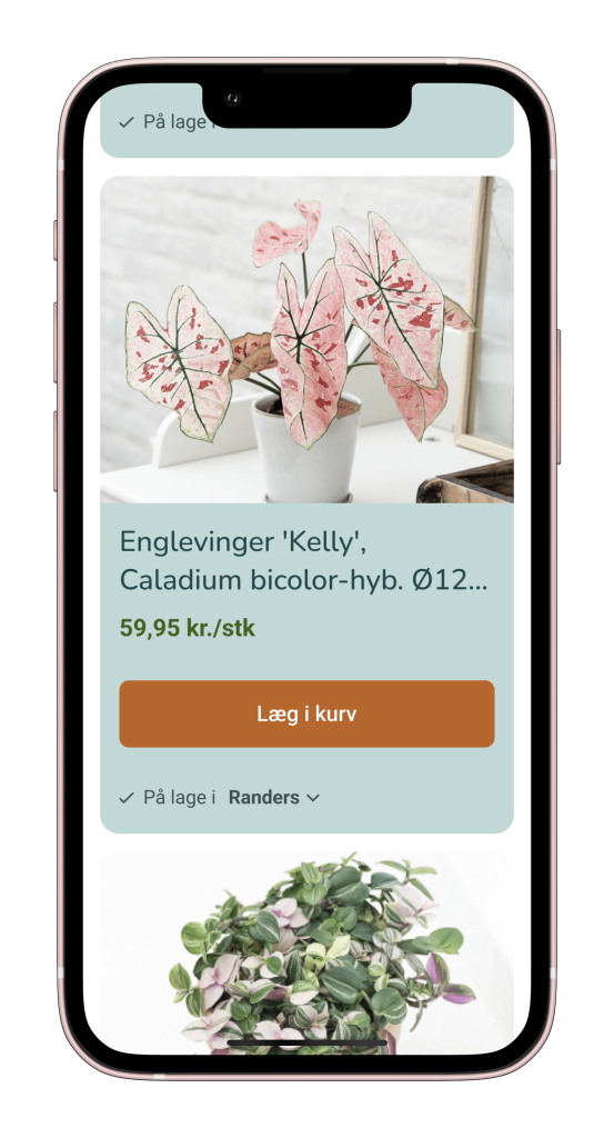
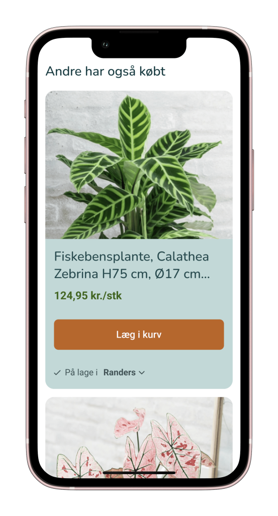
Mobile High Fidelity Mockup
The Design Process
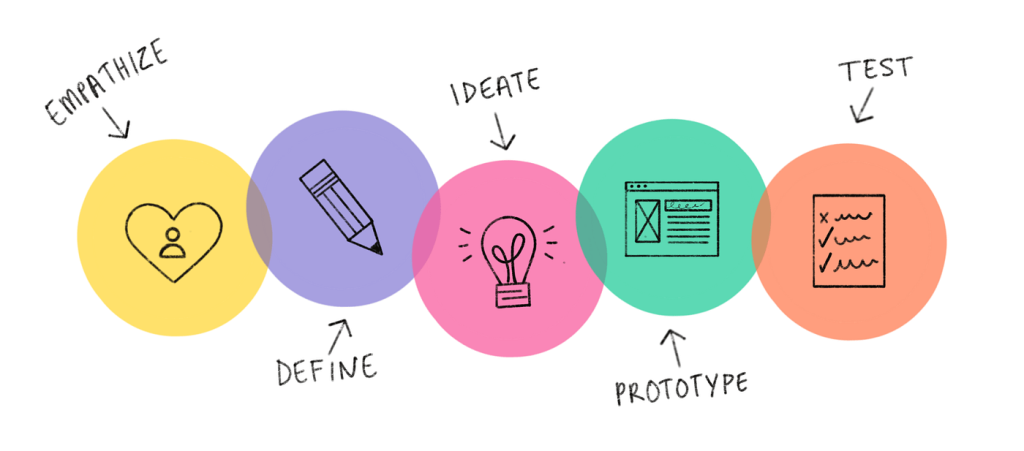
The project was completed following a design thinking approach, the Double Diamond model: Discover, Define, Develop, Test, Deliver.
Some of the design principles used are:
- Visual Hierarchy: Improved font size and color choices for better readability.
- CTA Placement: Strategically positioned CTAs for easy navigation.
- Gestalt Laws: Leveraged Gestalt principles to create visually appealing layouts.
- Hick’s Law: Limited options to prevent user choice paralysis.
- Responsive Design: Ensured seamless user experience on mobile devices.
Discover
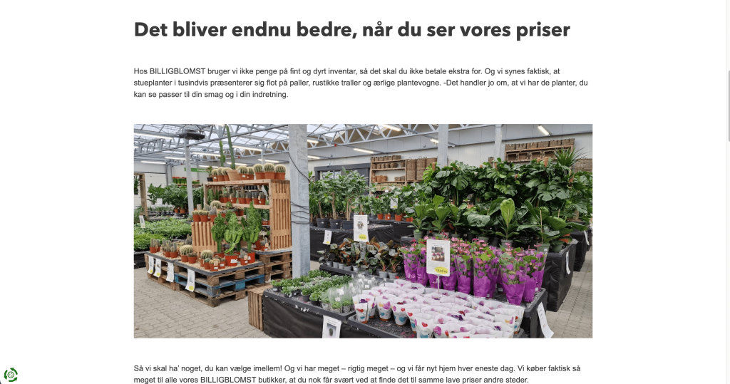
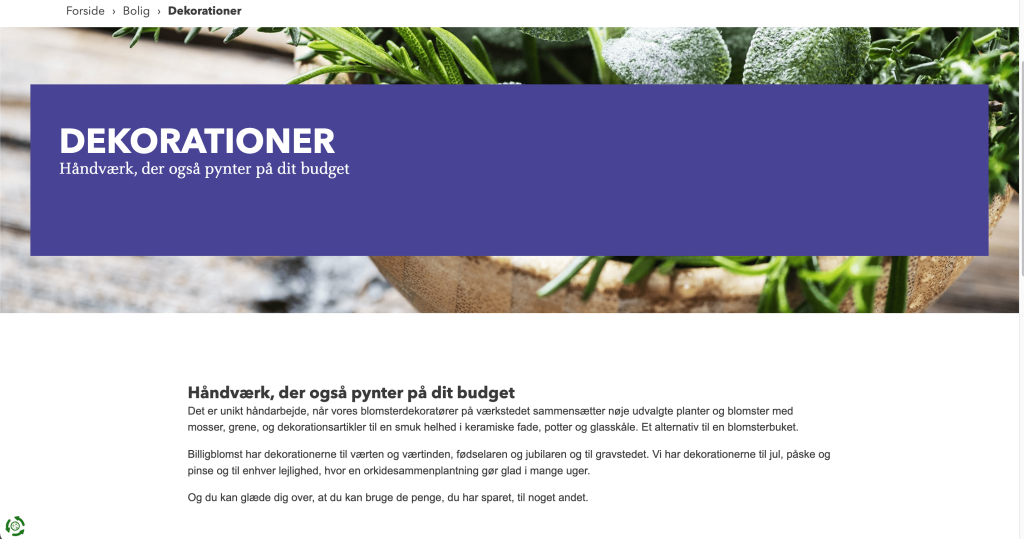
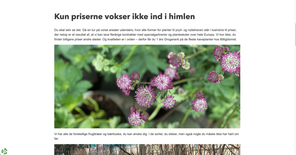
The current Billigblomst website – on desktop
Usability Testing
The usability test was conducted on desktop to identify usability issues on the website. The participant belongs to the target group and was asked to complete 3 tasks:
- Where do you find Stueplanter and can you please buy a plant?
- Can you find the price for a garden plant?
- Where would you go to find seasonal plants?
- Bonus question: How do you feel about the website in general (usability and visual)?
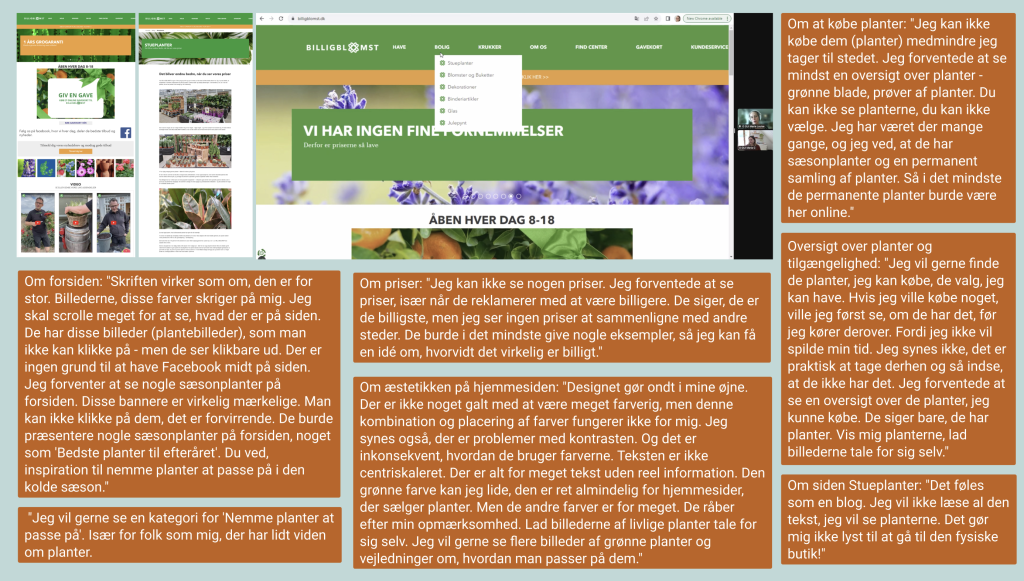
“The design hurts my eyes. The green colour I like, it’s quite common for the websites that sell plants. But the rest of the colours, it’s too much. They scream for my attention. Let the pictures of vibrant plants speak for themselves. I would like more pictures of green plants and guides on how to take care of them. There’s way too much text without real information.”
Findings from Usability Testing
The usability testing revealed that users need to:
- See an overview of the plants on the website
- See the plants’ availability in selected garden centres
- See the price for plants: “They say they are the cheapest, but I don’t see any prices to compare them with others.”
- Be inspired to buy by seeing what plants are in season, a collection of Easy to care for plants: “I would like to see the plants they have in season on the homepage. Like I said, I won’t go there if I don’t know if they have the plants I want to buy.”
- Have access to plant advice on the website
- Understand why she should sign up for a newsletter: “What do I receive if I subscribe?”
Usability Testing – Quotes
Heuristic Evaluation
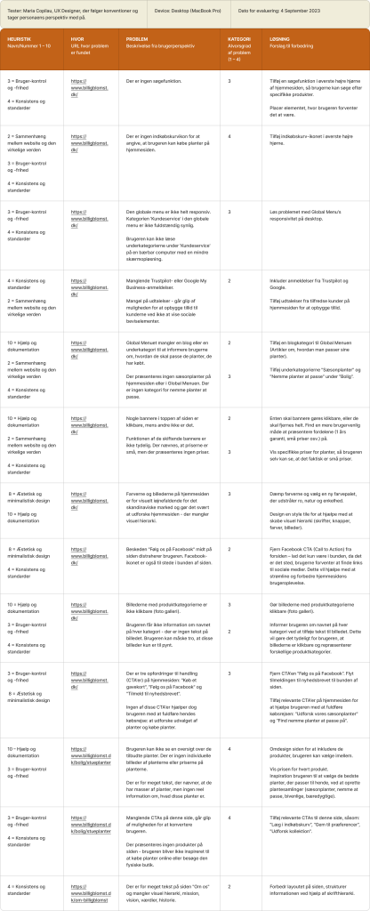
The expert evaluation aimed to identify usability issues on the Billigblomst website and uncover any missing elements in the user journey that could potentially hinder the experience for website users. I conducted this expert assessment with a focus on usability conventions while also considering the persona’s objectives.
Goal & Challenge: Anna Larsen, the persona, seeks to find seasonal plants on billigblomst.dk to adorn her home and terrace, all within a budget-friendly range. She requires the ability to purchase these plants online or, at the very least, view the available plant stock at the garden center before committing her time to visit with her family on the weekend.
The results of the expert assessment revealed that the website performed poorly in five key usability heuristics:
- Consistency and Standards
- Alignment with the Real World
- Help and Documentation
- User Control and Freedom
- Aesthetic and Minimalistic Design
Card Sorting Test
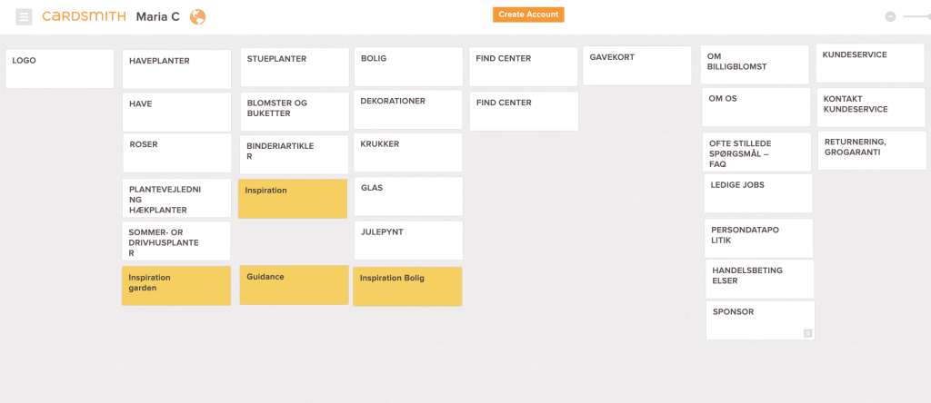
The open cart sorting test was conducted on 3 participants. The results show that the information architecture of the current website lacks many categories the users would look for on a garden center website.
The test showed the users would need more categories for both indoors and outdoors plants, a seasonal main category, a search field and a shopping cart icon.

Gangstertest
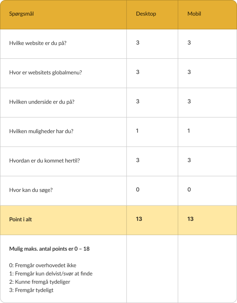
Gangstertest was conducted to analyse how easy or difficult is for an user to navigate on the website, how is the overall feeling of the customer journey. The billigblomst.dk website scored 13 both on desktop and on mobile. That means that the website’s navigation works well overall, but there is place for improvement.
Technical SEO optimisation
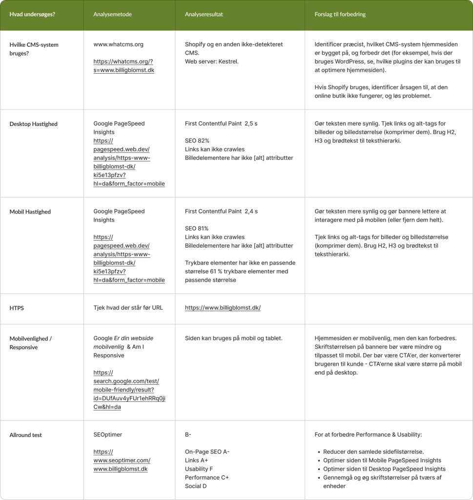
The technical SEO analysis was performed to identify how SEO-friendly the website is, and find way on improving it. The results show that the website’s speed and responsiveness can be improved. Some of the practices recommended are to to use headings properly, add alt-tag for images, and comprise the files size.
Define
Customer base
This website’s customer base mainly includes budget-conscious shoppers in Denmark interested in indoor and outdoor plants, flowers, decorations and gardening products. They are budget-conscious shoppers who seek affordable options without compromising on quality.
The emotional customer type for the billigblomst.dk website is yellow. This customer seeks balance, care, and well-being at affordable prices that won’t affect the family’s budget.
- The website needs to offer a carefully curated range of products that the customer can use to create a serene and welcoming home.
- The yellow customer is nurturing at heart, so the website should also provide guidance on how to take care of the plants.
- Also, this customer type will need inspiration on how to transform the home and garden into havens of comfort for the whole family.
Target Group
Target Group: Budget-Conscious Homeowners and Renters
- Age: 29 – 40 years old
- Gender: Woman
- Residence: Denmark
Life phase: Working mothers, married who recently became homeowners or want to save money for buying a house, while still living in a rental.
Income: They have a stable income, but they prioritise budget-conscious spending and seek affordable options.
Shopping behaviour: They create budgets for their home improvement projects and prioritize affordability when shopping for plants. They prefer the convenience of online shopping and are tech-savvy enough to browse and make purchases online. They are frugal shoppers: they are prudent with their spending and look for cost-effective options without compromising on quality.
Lifestyle and values: They enjoy making their home a cozy space using plants and also like DYIs. They are environmentally conscious and see indoor plants as a sustainable and eco-friendly way to improve air quality. They enjoy spending time with family and friends and being surrounded by nature.
Media Consumption: Instagram, lifestyle magazines (Bolius, BoligLiv etc.), Pinterest, DR lifestyle shows.
Persona
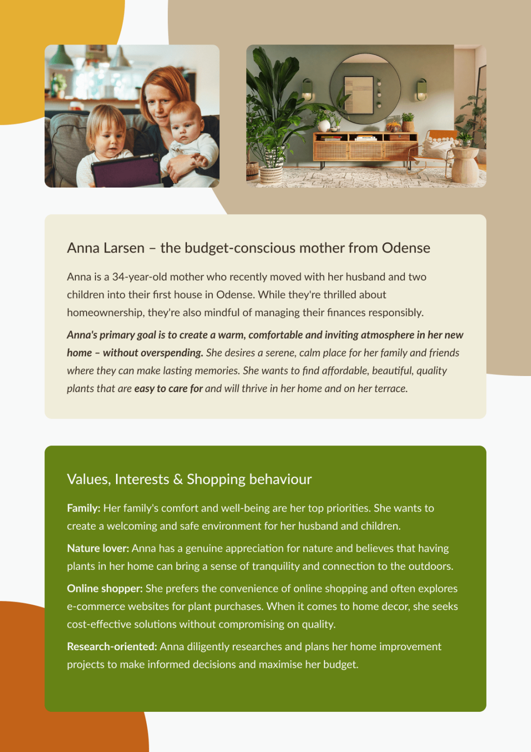
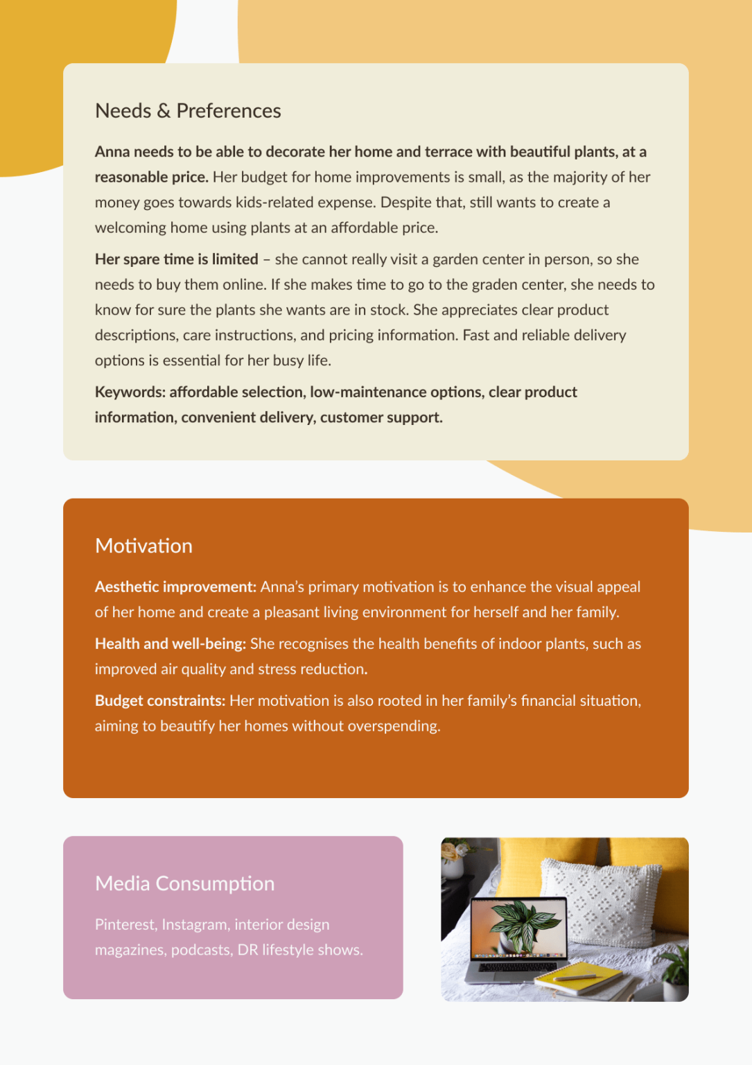
A persona was created as a representative of the target group. The design process that follows was created having this persona in mind.
New Sitemap
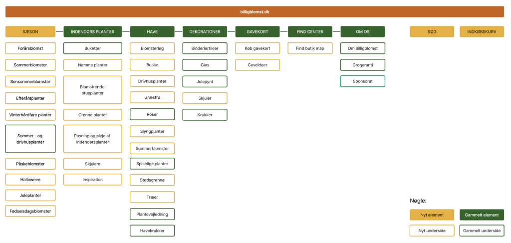
The new sitemap was created to answer users’ needs of more information within the Global Menu.
Develop
The new design
The new design of the website was created having in mind the users needs, pain and goals when buying plants. There are specific conventions and design principles I used in the new wireframe of the website, both for desktop and mobile:
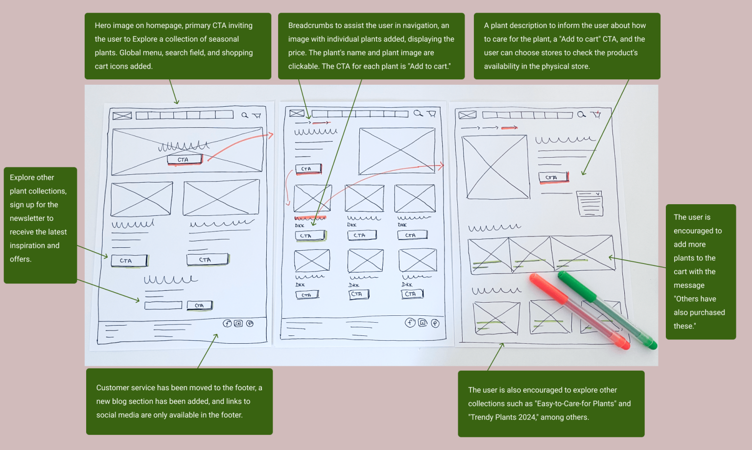
- Relevant CTAs were added on the homepage to nudge the user into engaging with the products. Also, the CTAs present on the subpages are meant to help the user complete the buying journey. Fitt’s Law was used when designing the CTAs so that they are not too far away, and they are big enough (especially on mobile).
- The visual hierarchy of the information presented needed to be re-designed. Therefore, using both proper font size and colours a new visual hierarchy was created. The colours used across the website are in accordance to the yellow emotional customer type, evoking a feeling of calmness and well-being.
- The Gestaltlaw was used to create a visually appealing website by presenting the common elements together. For example, the plant image, description, price and CTAs are all within a rectangular, making it easy for the user to navigate through the plant collection.
- Hick’s Law was taken into account when creating the plant collections. On the homepage there are only 4 plant collections presented, so that the user wouldn’t feel overwhelmed and experience choice paralysis.
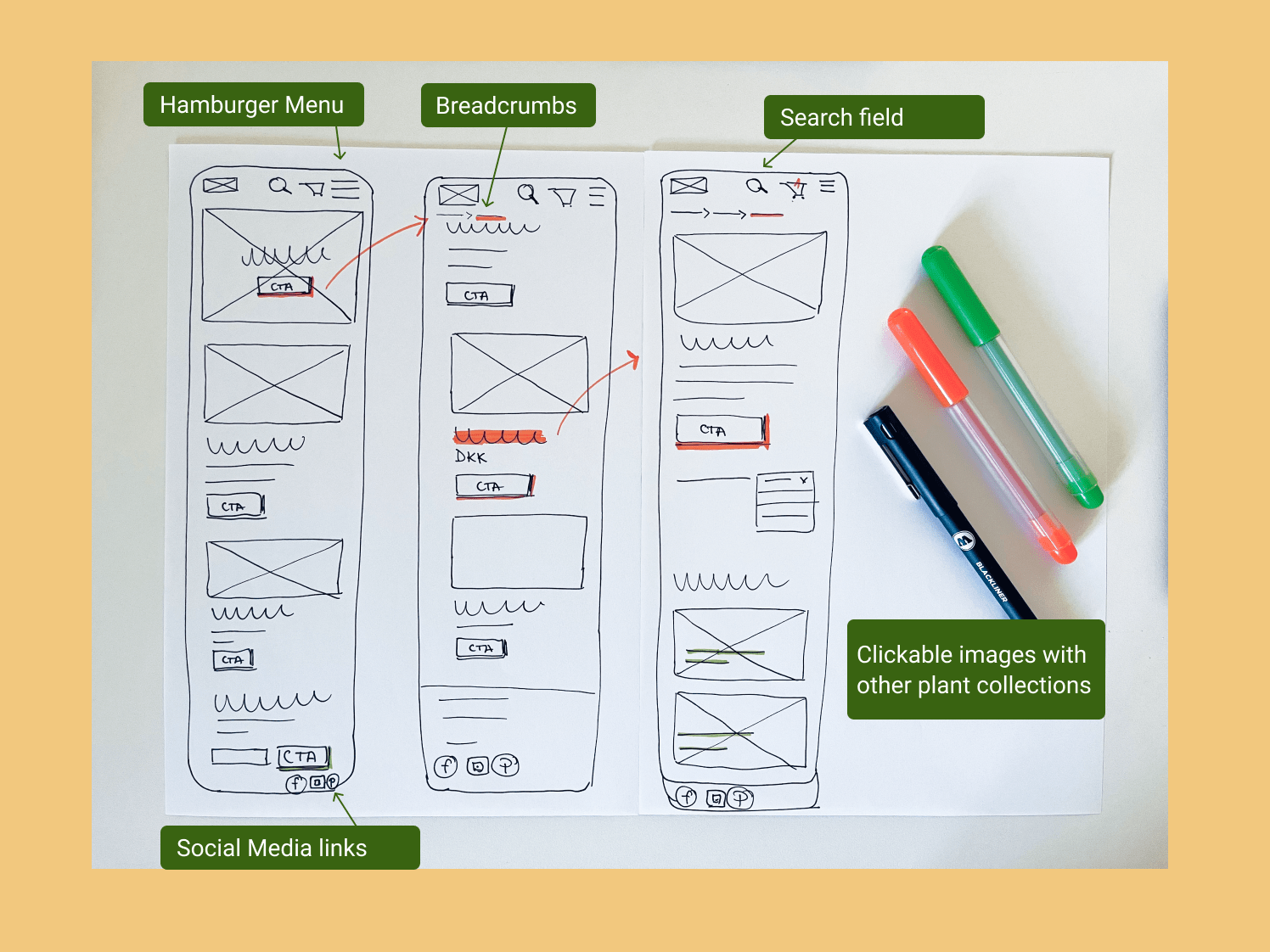
- The mobile design is a bit different from the website, using a burger menu and bigger CTAs. Also, certain pieces of information were removed so the user doesn’t need to scroll too much.
- To create an aesthetically pleasing website, I have also used other design principles, such as repetition, proportion, rhythm, and white space.
Sketches
Skecthes were drawn to illustrate a user’s taskflow through some of the pages. The user clicks on the main CTA on the homepage and is then directed to a seasonal plant collection page, from which he can either add to basket or click on the plant name/image to read more.
Desktop and Mobile Sketches
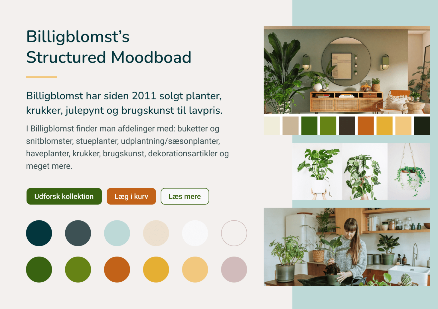
Structured Moodboard & Style Tile
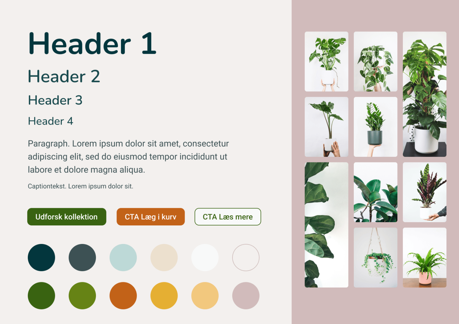
The structured moodboard illustrates how the website could look like, capturing the feeling of the website through visual elements like headlines, paragraphs, and colours. Some images were added to highlight the direction of the design.
Mini design manual
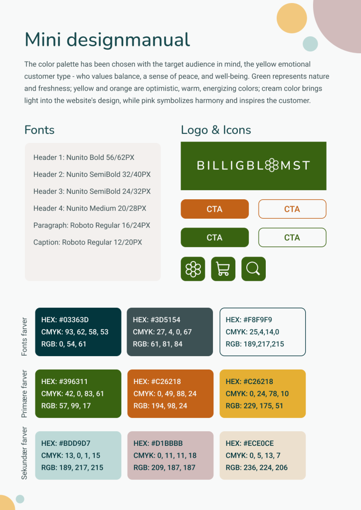
The mini designmanual includes all the elements meant to be used on the new Billigblomst website. For a consistent brand look, these specifications should also be used across other channels of communications: offline materials, social media, etc.
The manual includes the type and size of fonts, the primary and secondary colours, new logo, CTAs and icons. The new design of the website should better resonate to the yellow customer type so the colours and shapes were carefully selected for this.
Deliver
Desktop Mockup
Having in mind the findings from the usability testing, persona’s needs and pains, and the mini designmanual, I designed the Desktop mockup of the new website. There are 3 pages designed, following a specific user flow: user clicks to explore the autumn plant collection, gets redirected through a CTA to a new subpage, then can either add to basket directly, or explore further the plants.
- The new homepage includes also other elements that answer users’ needs identified in the research stage of the project:
- There are 4 other collections presented on the homepage (including Easy to care for plants)
- There is a section with How to take care of your plants
- The category images are now clickable and have a name added on them
- The newsletter sign up section was improved to explain the user what it gets if subscribed
- And of course, the new global menu is in place, better explaining the content of the website to users


Mobile Mockup
The mobile desktop includes almost everything that the desktop mockup includes, with a few adjustments:
- The global menu is represented by the burger menu
- The plants presented on the page are fewer
- The CTAs are bigger
- The font is certain places is bigger to allow the user to read better


Explore other projects
UX DESIGN PROJECT
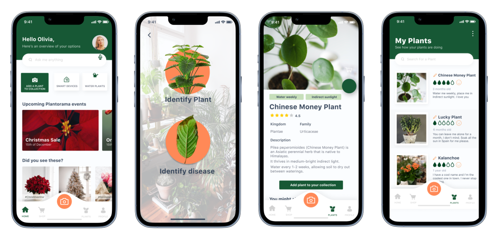
Creating an app for Plantorama’s customers that combines plant identification and monitoring through a virtual recognition model in IBM Watson Studio.
UX DESIGN PROJECT
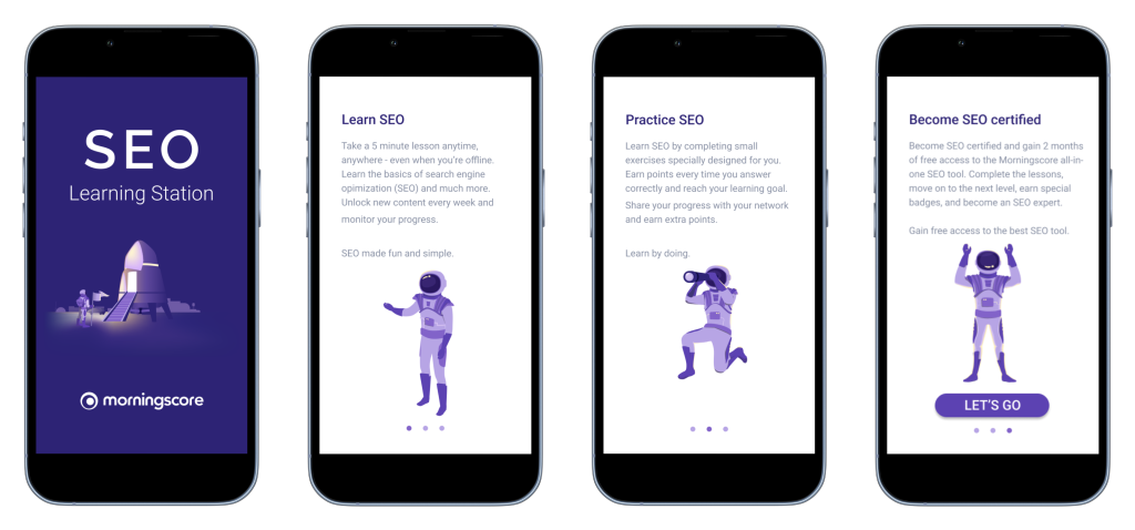
Designing a gamified app for SEO beginners that leverages gamification and motivation theory to keep users engaged and motivated in their learning journey. Bachelor Thesis Project.
Contact
© 2023 Maria Copilau – UX Designer | All rights reserved
